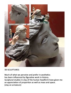
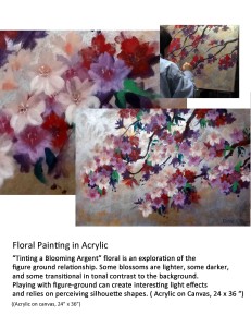
1 – Refer to the student work above. Try to be casual, but still somewhat planned in layout…try for the old “simultaneous loose-tight” feel. No one cares for completely careless work, nor for overly slick presentations. “ Too clever is dumb.” It is important to think in terms of ‘marketing’: Your objective is to present your level of preparedness and, most importantly, persuade a committee that you are a skilled, talented and committed candidate. It is not just to create a pretty portfolio. Here are some thoughts on how to get the most out of what you are presenting.
2 – Refer to the student work above. Always take pictures of yourself at work on pieces. Or re-enact it. (over-the-shoulder partial hand and head shots are best). Ask a friend. Crop and then combine with the full finished piece and a blow-up of a detail. This can create much more visual richness than a single documentary photo, because you are personalizing it, authenticating it as your own work, and adding an element of time by showing work as it progressed. Think about message: “I am green and growing, hard working, full of promise” is better than “ta-dah, am I not wonderful”. Also, with several pics there are more possibilities for layout.
3 – Refer to the student work above. Always include some type. A short explanation of the work, size and materials, what you were trying to do and what you learned by doing it. Don’t assume they understand what they see. Also, it shows you are thinking about what you are doing. Keep it short, 3-5 lines. Your audience is primarily visual. Even a poetry quote can work. Two or three type sizes are best (no more than 3). Headline, body copy, and caption – magazines know what they are doing. Look at design mags such as “Print” for exemplars. A hierarchy of type size creates a sort of status for the image and content.
4 – Pick the weakest piece. Ask a friend. Then delete it! This will instantly raise the level of the overall portfolio. Don’t be sentimental. Just let it go.
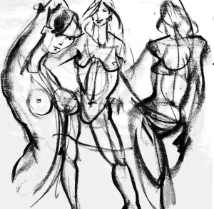
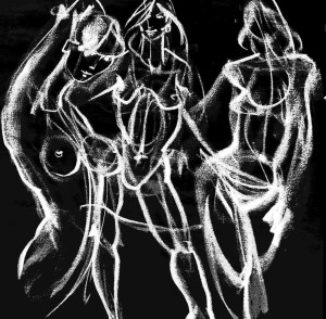
5 –Refer to the student work above. Line drawings can sometimes look better if you can combine several on a page or even try “inverting” , meaning black lines become white on dark background, like a negative. Try the same strategy as number 2 above if possible. Forgot to take process shots of yourself? Re-enact one. Look at art-books to see how line drawings can be handled. Line drawings can be combined with photos – You can even dial back a line drawing to 40% gray, blow up a detail, and slide it under your photos to relax, personalize or enliven your composition (see final example)..


