Good news from a recent student, July 29, 2015 –

Matt just sent me this note – congratulations! Matt took several courses from me – Garden Design, Perspective, Building Architectural Models and Maquettes.  ( Now the work really begins! )-

“Hi Tony,   Just wanted to let you know that i was accepted to the MLA program at Guelph. I want to thank you for all your help and guidance over the last few years. Your courses are what taught me to become a proficient drawer. Again I can’t thank you enough.     Matt C. “

Accepted Carleton Architecture! Congrats…(click title)

http://issuu.com/guillermobourget/docs/guillermobourgetportfolio

(If you follow this link you will find many examples of architecture and other portfolios.)

Hello Tony,    This is Guillermo. I was enrolled in 3 of your courses at Emily Carr in the fall term, I would like to thank you for helping me develop my skills in architecture.  I received my letter of acceptance from Carleton University School of Architecture. For the last months I developed a Portfolio in which I included some art pieces we did in the classroom. I also included the model of the 15 story building we made in the modeling class, (well I made it at my home, but I couldnt have completed it without your guidance). Your website is fabulous it helped me out a lot to create an idea of what a portfolio should look like. I would be pleased if you take a look at mine at this link. If you have any ideas on how I can improve it please let me know. I would appreciate it a lot! I would be pleased if you put it up in your website, thank you again!     Guillermo

 – Congrats Guillermo, I am very happy you were successful getting into Architecture At Carleton. Looking at your portfolio, I honestly would not change anything. It looks casual, but organized. That’s the perfect message for a school audience. “Too clever is dumb.” Your highrise looks good and shows you can do 3D stuff. Perfect. Congratulations and best of luck. Stay in touch and give me your impressions of the school after your beginning year is over. You are justifiably proud of your work and your acceptance…Tony O’

GESTURE AND MODELLING STUDIES (click photo title) – Portfolio Ideas

GEHRY AND FLW

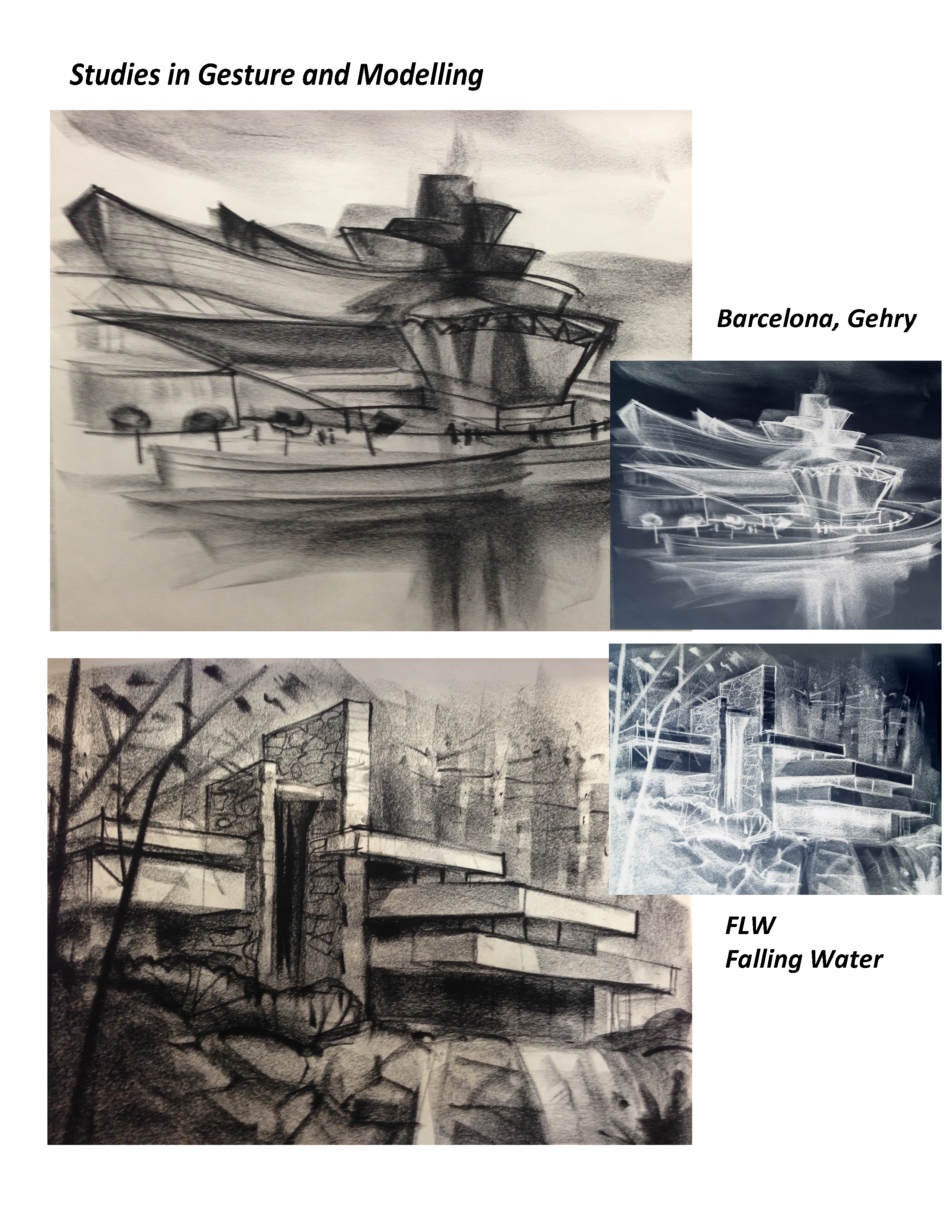
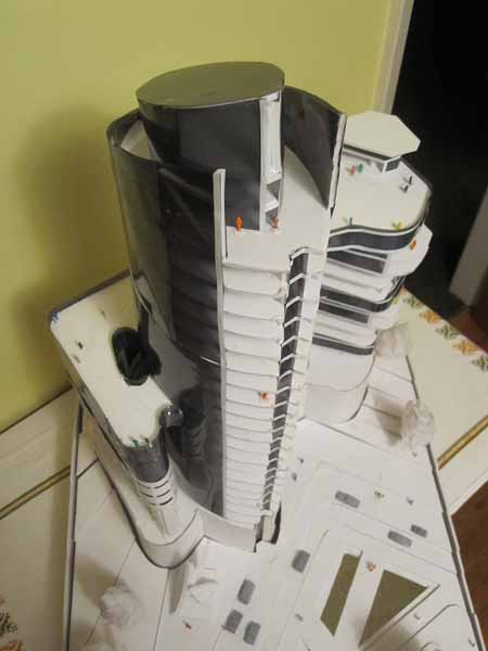
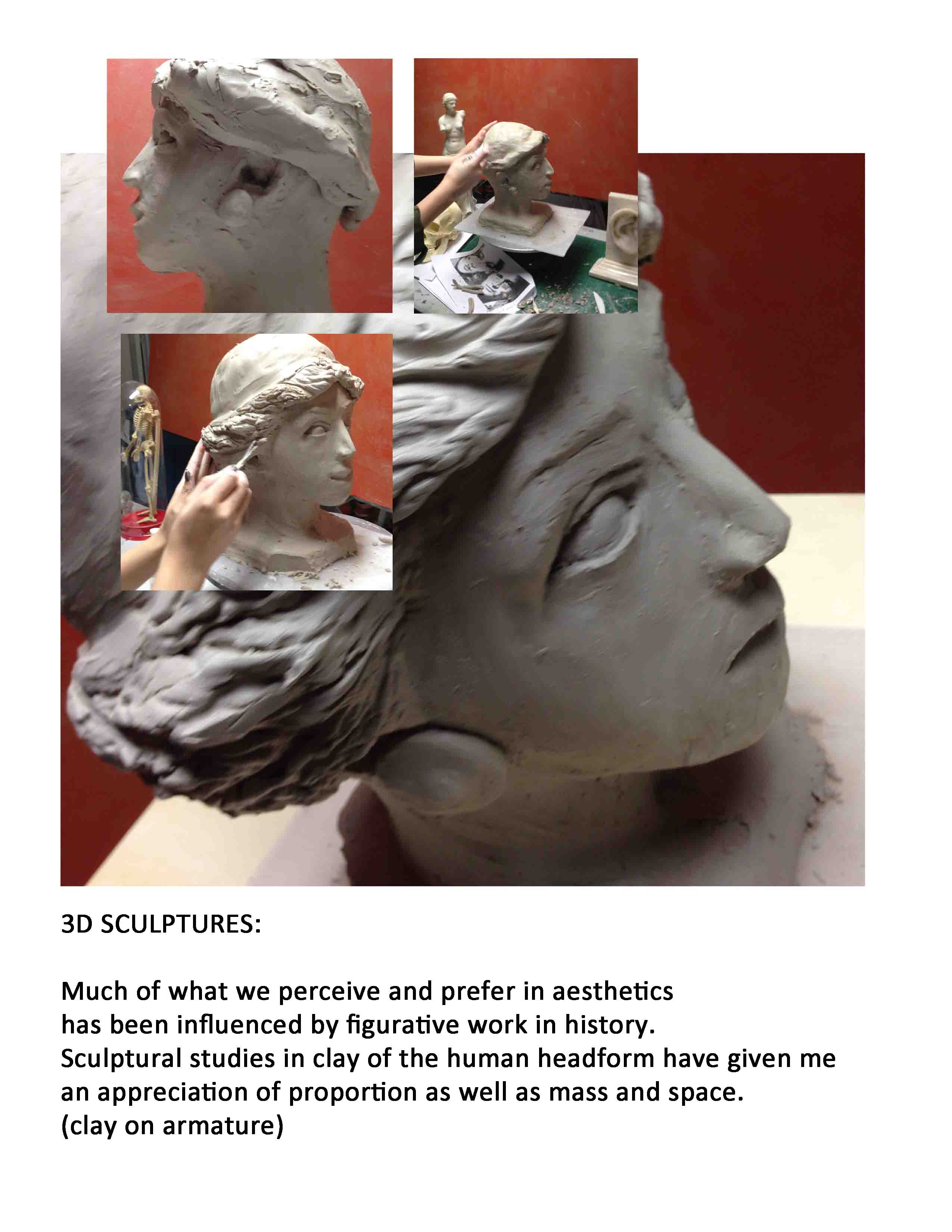
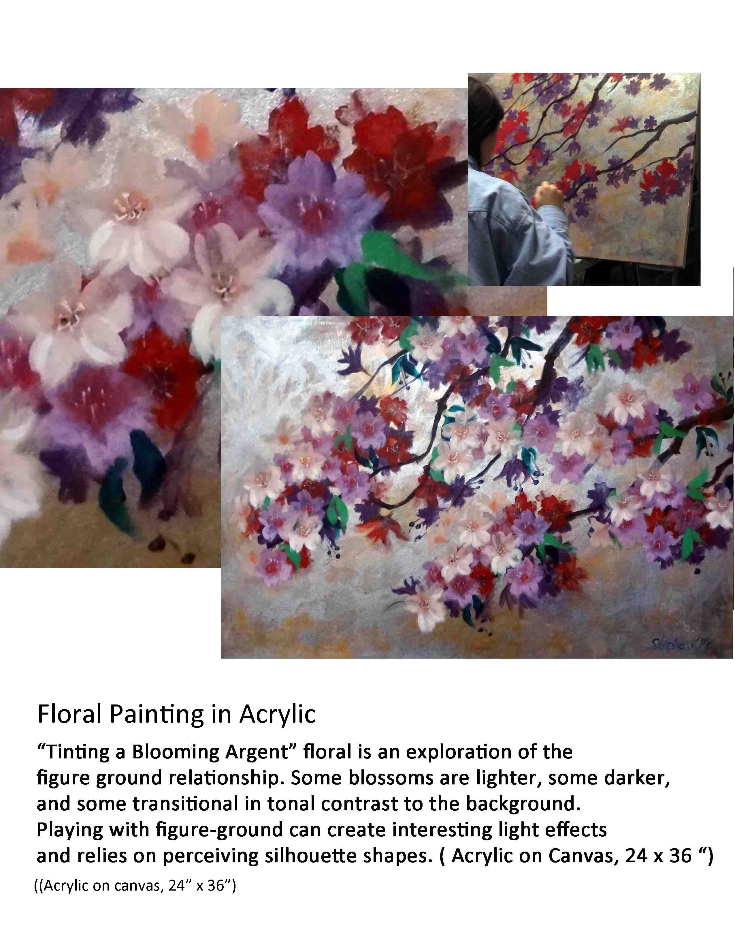
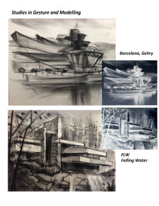
Quick studies, such as gesture and modelling (shading), can be effective in portfolios. They show an ability to be loose and free in your explorations and approach. Freedom in sketching can help personalize a portfolio which can tend to look a bit ‘cold and rigid’. As above, try using a variety of Photoshop conversions and combining several images on a page in a layout – with some type that describes what and why these studies are done.  For layout ideas, just google: “architecture student portfolio template”.  For more on this see my post called: Ten Ways of Seeing and Drawing (Mar 15, 2015) , under the category “Perceptual and creative drawing.” I will make more vids on this subject in near future.

Notes for:  Ten Ways of Seeing and Drawing       Tony O’Regan

 We think of drawing as being comprised of 10 different perceptual filters, abilities or ways of seeing. Like the filters a photographer might use with a camera, we can use them individually or in combinations on a single drawing to achieve a near-infinite variety of effects. When you have mastered them, even at a basic level, you will have a powerful “tool kit” for use in drawing and design.

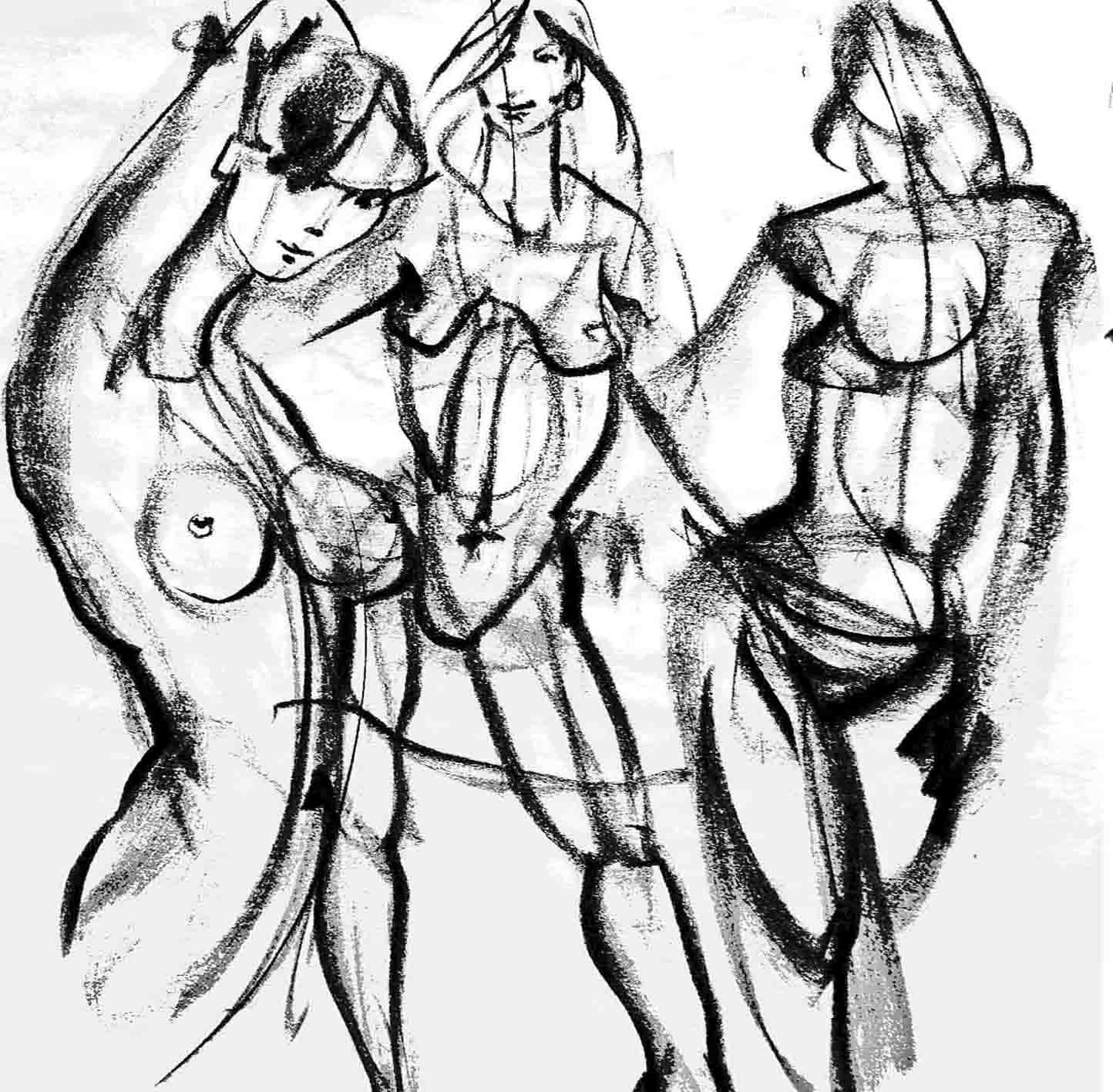
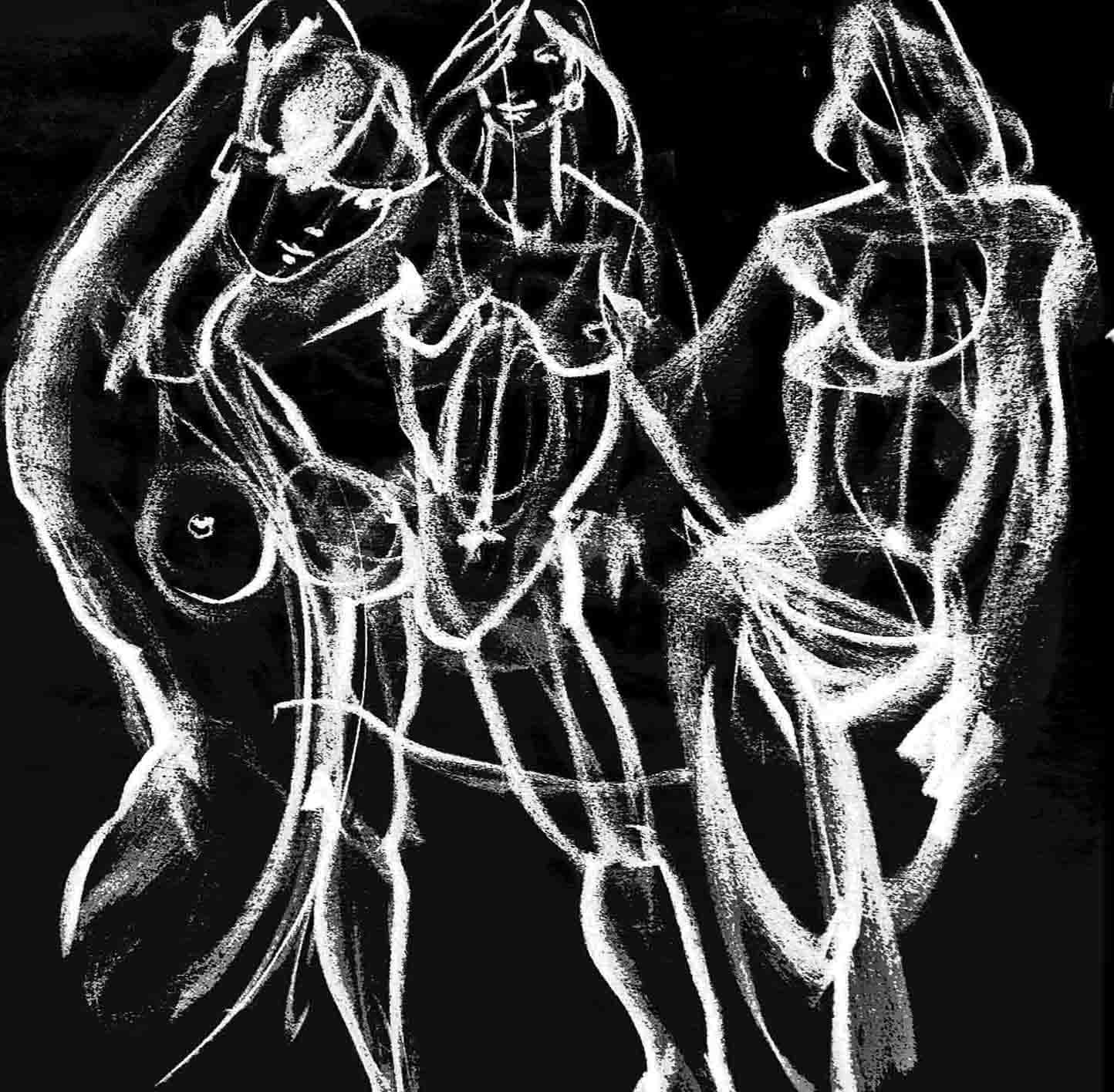
 Gesture:   Like the miming gestures one might make with the hands and arms when describing, for example, a vase of flowers or a building.

 Contour:   Draw the lines in a subject with enhanced tactile content by strong belief that you are ‘touching’ with finger tips or flats. This belief is transmitted into the marks and on to the viewer.  Edges (finger tips) become lines; surfaces (finger flats) become textures.

 Mass:   The 3d volumetric ‘heft’ of a subject – like a wireframe but with more feeling.

 Space:   Think of a subject immersed in water. Draw the water, encountering the subject and pausing the medium where it stops against the subject. The sum total of stoppages implies the form. But do not draw the actual form…concentrate on the space. The water metaphor helps.

 Shape:   The positive Shape is like the shadow of a subject projected on a wall. The negative silhouette is the reverse. Concentrate on ‘shape-making…don’t draw and colour in.

 Figure Ground:   A shape or object has 3 ways to contrast with the background: darker than, lighter than or transitional (part darker and part lighter). The ‘transitional’ is also called a “figure-ground reversal”. You take control and choose.

 Tonality:   Translate a continuous toned image into 3 or 4 tonal values: The lights give Sparkle. The darks give impact. The mid-tones give subtlety and richness. This creates a ‘tonal design’ versus a mere ‘documentation’.

 Shading:   Select a light source and logically create shade sides and cast shadows. This is what we normally try to do when shading naturalistically.

 Geometrics :  Perspective and other systems, such as paralines) Apply the methods of geometry to creating the 3d visual illusion. The three main visual cues for depth are: overlapping, diminution, convergence. These are supported by ‘position on a background plane’, atmospherics, lineweights, colour temperature, degree of detail and sharpness of focus, etc.

Composition:   Apply an ordering concept, a design,  to the elements in the picture. There are many traditional systems, or you may create one of your own through observation or informed intuition. This is the ‘design concept’ we apply to the organization of the image. Also consider scale, format, cropping, focal points, eye path, dominance, balance, numbers and hierarchy of shapes, and other general design principles.


SKETCH-MODEL EXAMPLE

IMG_3708 IMG_3728 IMG_3723 IMG_3712

Learn to do this in my Emily Carr course on “Building Architectural Models and Maquetttes”. This is a typical model built by one of my students. It took about 20-24 hours of work with hot gluegun and foamcore. It is a ‘design sketch model’ in that the purpose is to be able to build-change-rebuild during the design process. Generally, buildings designed with 3d modelbuilding supplementing the process are richer in terms of form. It can look quite finished if photographed carefully, but the main purpose is for design.

ACCEPTED TO UBC ARCHITECTURE SCHOOL! (Click title – link to portfolio below)

Congrats on your acceptance! (I just got this note from a recent student today. Jordan took several of my architecture related model-building, design, and drawing courses, all represented in his portfolio) :  

 Hey Tony!  I found out today that I was accepted into the UBC architecture program for this coming Fall. I could not have done it without your help and guidance, and I look forward to joining you in some more classes this summer.  I’ll attach my portfolio to this email in case you want to use it as an example on your website.  All the best,     Jordan

Grubner_Jordan_MArch1_2014Portfolio

BUILDING SKETCH MODELS (click title for pics)

ADRIAN BEHENNAH, a student who took several of my courses, built this model in 2014. The studio class starts with a basic plan provided, but participants are encouraged to use the model as an individual exploration of space and form in whatever direction they wish. Sketch models use a very easy process of foamcore and hot glue gun. Flexible window plastic can be found in report covers and at photography shops (tinted filter or lighting ‘gels’). The idea is to keep the materials simple and aim for a sculptural flexibility. This is very different from finished presentation models. The idea is build it quickly study it, change it, fix it, rebuild it, perhaps several times. Concurrent with modelling, the designers develop plans and other design drawings, working back and forth in 2d and 3d. The model  can look quite good when photographed even though roughly built. Many designers use this method. It tells us something quite different from either a drawing or computer model. I teach this method three times a year through Emily Carr Continuing Studies – BUILDING ARCHITECTURAL MODELS AND MAQUETTES. It’s fun and a great portfolio builder! Include several angles and a process shot (with your hands cutting components at an early stage) and it makes a very impressive page for your portfolio whether for schools or resume. It’s important to caption it as a ‘study in model building technique’ rather than a piece of fully-considered architectural design which, of course, requires much more in-depth work.

ADRIAN BEHENNAH M&M2014 (5)M&M ADRIAN BEHENNAH M&M2014 (3).jpgADRIAN BEHENNAH M&M2014 (7)

M&M ADRIAN BEHENNAH M&M2014 (3).jpgADRIAN BEHENNAH M&M2014 (4)M&M ADRIAN BEHENNAH M&M2014 (3)


LAYOUT IDEAS FOR PORTFOLIO PAGES (Click title)

STEPHANIE PAGE SAMPLE1 STEPHANIE PAGE SAMPLE2_edited-1

my figurative positive my figurative positive_edited-1


1 – Refer to the student work above. Try to be casual, but still somewhat planned in layout…try for the old “simultaneous loose-tight” feel. No one cares for completely careless work, nor for overly slick presentations. “ Too clever is dumb.” It is important to think in terms of ‘marketing’:  Your objective is to present your level of preparedness and, most importantly, persuade a committee that you are a skilled, talented and committed candidate. It is not just to create a pretty portfolio. Here are some thoughts on how to get the most out of what you are presenting.

2 – Refer to the student work above. Always take pictures of yourself at work on pieces. Or re-enact it. (over-the-shoulder partial hand and head shots are best). Ask a friend.  Crop and then combine with the full finished piece and a blow-up of a detail. This can create much more visual richness than a single documentary photo, because you are personalizing it, authenticating it as your own work, and adding an element of time by showing work as it progressed. Think about message: “I am green and growing, hard working, full of promise” is better than “ta-dah, am I not wonderful”. Also, with several pics there  are more possibilities for layout.

3 – Refer to the student work above. Always include some type. A short explanation of the work, size and materials, what you were trying to do and what you learned by doing it. Don’t assume they understand what they see.  Also, it shows you are thinking about what you are doing. Keep it short, 3-5 lines. Your audience is primarily visual. Even a poetry quote can work. Two or three type sizes are best (no more than 3). Headline, body copy, and caption – magazines know what they are doing. Look at design mags such as “Print” for exemplars.  A hierarchy of type size creates a sort of status for the image and content.

4 – Pick the weakest piece. Ask a friend.   Then delete it! This will instantly raise the level of the overall portfolio. Don’t be sentimental. Just let it go.

5 –Refer to the student work above.  Line drawings can sometimes look better if you can combine several on a page or even try “inverting” , meaning black lines become white on dark background, like a negative. Try the same strategy as number 2 above if possible. Forgot to take process shots of yourself? Re-enact one. Look at art-books to see how line drawings can be handled. Line drawings can be combined with photos – You can even dial back a line drawing to 40% gray, blow up a detail, and slide it under your photos to relax, personalize or enliven your composition (see final example)..

Architecture and Environmental Design Portfolios

Many design schools are adding on-line examples of successful entrance portfolios. This is great, because many people are mystified by the requirement for a portfolio. BUT – Keep in mind that schools would be likely to show only the BEST examples, so don’t be too intimidated. By the same token it can be enlightening to look at the projects categories and get an idea of the breadth and depth that some of your competition can display.  Also keep in mind that the portfolio is only one factor in your application. Try to include some space planning, graphics, and 3D work. Try to think outside the box – they are not looking for mechanical pieces. Be creative. Check the other entries I have included under ‘portfolios’.  Read the prospectus of the school in question and try to discern their ‘values’, such as ‘sustainable design’.  Also, google some phrases such as  ‘ portfolios for admission to (univ name)…’ or

Examples of Successful Portfolios:

Check this link out:   http://evds.ucalgary.ca/content/master-architecture-march-admissions

error: Content is protected !!