BUILDING SKETCH MODELS (click title for pics)

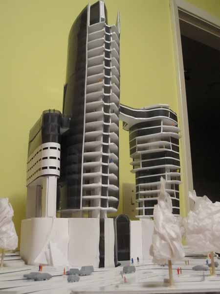
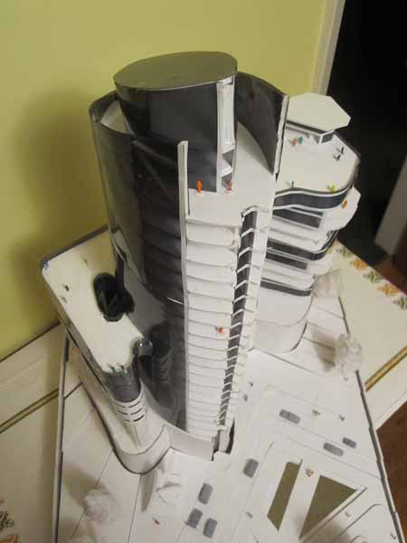
ADRIAN BEHENNAH, a student who took several of my courses, built this model in 2014. The studio class starts with a basic plan provided, but participants are encouraged to use the model as an individual exploration of space and form in whatever direction they wish. Sketch models use a very easy process of foamcore and hot glue gun. Flexible window plastic can be found in report covers and at photography shops (tinted filter or lighting ‘gels’). The idea is to keep the materials simple and aim for a sculptural flexibility. This is very different from finished presentation models. The idea is build it quickly study it, change it, fix it, rebuild it, perhaps several times. Concurrent with modelling, the designers develop plans and other design drawings, working back and forth in 2d and 3d. The model  can look quite good when photographed even though roughly built. Many designers use this method. It tells us something quite different from either a drawing or computer model. I teach this method three times a year through Emily Carr Continuing Studies – BUILDING ARCHITECTURAL MODELS AND MAQUETTES. It’s fun and a great portfolio builder! Include several angles and a process shot (with your hands cutting components at an early stage) and it makes a very impressive page for your portfolio whether for schools or resume. It’s important to caption it as a ‘study in model building technique’ rather than a piece of fully-considered architectural design which, of course, requires much more in-depth work.

ADRIAN BEHENNAH M&M2014 (5)M&M ADRIAN BEHENNAH M&M2014 (3).jpgADRIAN BEHENNAH M&M2014 (7)

M&M ADRIAN BEHENNAH M&M2014 (3).jpgADRIAN BEHENNAH M&M2014 (4)M&M ADRIAN BEHENNAH M&M2014 (3)


PRESENTATION MODEL (click title for pics)

This is a ‘finished’ presentation model in styrene plastic.  It was part of my masters thesis project (R&D FACILITY FOR INTERNATIONAL SUBMARINE ENGINEERING CO.)  The reflective water is ‘wet-look’ bathroom tile. I built it in 3 weeks – very different time scale from a sketch model in foamcore and glue gun. I actually built it in foamcore originally (:-) and then got talked into doing a styrene model (:-(  One important difference between finished and sketch models is that you need well developed design drawings for the finished presentation model.  In contrast the plans are developed simultaneously with the sketch model, so the model and plan affect each other. Also, the styrene model is not ‘fun’ after the first one. The fun is in the exploratory and developmental aspects of the foamcore sketch model.

M&M ADRIAN BEHENNAH M&M2014 (3).jpgISE THESIS MODEL


LAYOUT IDEAS FOR PORTFOLIO PAGES (Click title)

STEPHANIE PAGE SAMPLE1 STEPHANIE PAGE SAMPLE2_edited-1

my figurative positive my figurative positive_edited-1


1 – Refer to the student work above. Try to be casual, but still somewhat planned in layout…try for the old “simultaneous loose-tight” feel. No one cares for completely careless work, nor for overly slick presentations. “ Too clever is dumb.” It is important to think in terms of ‘marketing’:  Your objective is to present your level of preparedness and, most importantly, persuade a committee that you are a skilled, talented and committed candidate. It is not just to create a pretty portfolio. Here are some thoughts on how to get the most out of what you are presenting.

2 – Refer to the student work above. Always take pictures of yourself at work on pieces. Or re-enact it. (over-the-shoulder partial hand and head shots are best). Ask a friend.  Crop and then combine with the full finished piece and a blow-up of a detail. This can create much more visual richness than a single documentary photo, because you are personalizing it, authenticating it as your own work, and adding an element of time by showing work as it progressed. Think about message: “I am green and growing, hard working, full of promise” is better than “ta-dah, am I not wonderful”. Also, with several pics there  are more possibilities for layout.

3 – Refer to the student work above. Always include some type. A short explanation of the work, size and materials, what you were trying to do and what you learned by doing it. Don’t assume they understand what they see.  Also, it shows you are thinking about what you are doing. Keep it short, 3-5 lines. Your audience is primarily visual. Even a poetry quote can work. Two or three type sizes are best (no more than 3). Headline, body copy, and caption – magazines know what they are doing. Look at design mags such as “Print” for exemplars.  A hierarchy of type size creates a sort of status for the image and content.

4 – Pick the weakest piece. Ask a friend.   Then delete it! This will instantly raise the level of the overall portfolio. Don’t be sentimental. Just let it go.

5 –Refer to the student work above.  Line drawings can sometimes look better if you can combine several on a page or even try “inverting” , meaning black lines become white on dark background, like a negative. Try the same strategy as number 2 above if possible. Forgot to take process shots of yourself? Re-enact one. Look at art-books to see how line drawings can be handled. Line drawings can be combined with photos – You can even dial back a line drawing to 40% gray, blow up a detail, and slide it under your photos to relax, personalize or enliven your composition (see final example)..

error: Content is protected !!